Page6 - How I Added Guides and Links to the Homepage of my FREE AI App to Automate Social Media Posting
Because a static page is like a coffee shop with no conversations, it looks good, but feels empty.
Have you ever opened your beautifully designed homepage only to realize… it’s lifeless? Everything’s in place the layout, the colors, the title section but something’s missing: content that moves, guides that grow, and links that lead somewhere.
Get the full code after reading.
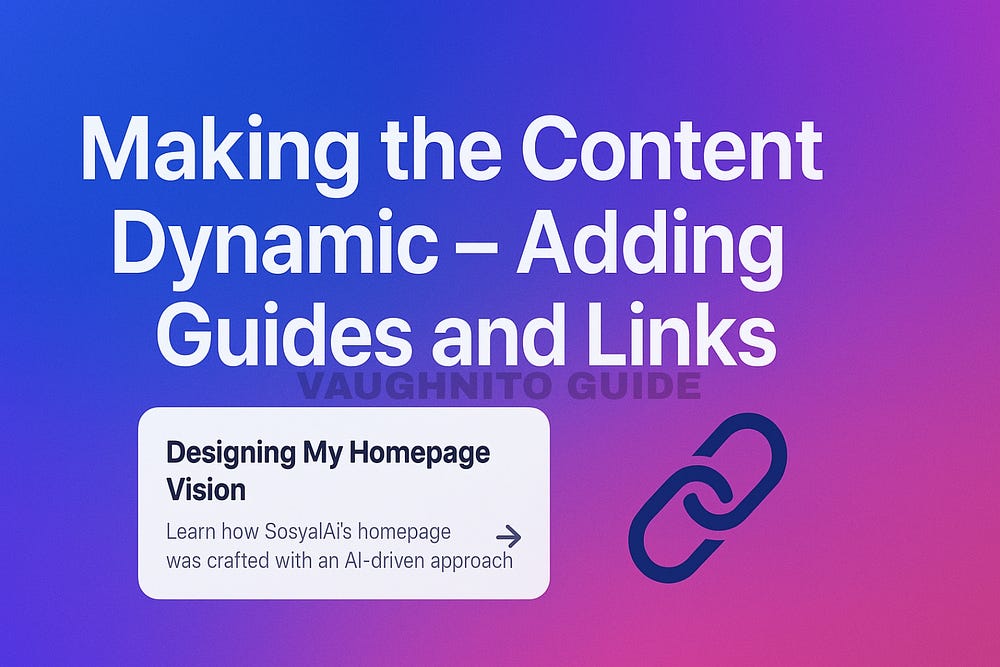
That was exactly me building SosyalAi. My homepage looked polished, but it didn’t guide my users anywhere. So I decided to turn it from static to dynamic by adding guides, interactive links, and responsive grids using a little JavaScript magic.
Here’s how I made my content come alive.
The Day I Realized Static Doesn’t Scale
At first, I hardcoded my guides section line by line.
<div>
  <h2>Getting Started with SosyalAi</h2>
  <p>Learn how to set up your social post automation in minutes.</p>
</div>
<div>
  <h2>Building Your First Campaign</h2>
  <p>From concept to auto-posting — a step-by-step guide.</p>
</div>
It looked fine… until I wanted to add a third guide. And a fourth. Suddenly, I was duplicating divs like I was printing flyers in 2005.
That’s when I remembered I’m a developer, not a typist. So I decided to go dynamic.
Step 1: Creating an Array of Guides
I started by creating an array inside my component like a mini database right in the code.
const guides = [
  {
    title: "Designing My Homepage Vision",
    description: "Learn how SosyalAi’s homepage was born from an AI-driven design mindset.",
    link: "/articles/designing-my-homepage-vision",
  },
  {
    title: "Building the Core Layout",
    description: "How I structured SosyalAi’s skeleton using Next.js 15 and clean components.",
    link: "/articles/building-the-core-layout",
  },
  {
    title: "Adding Animated Gradient Backgrounds",
    description: "Giving the homepage life and motion through Tailwind’s animation magic.",
    link: "/articles/animated-gradient-backgrounds",
  },
];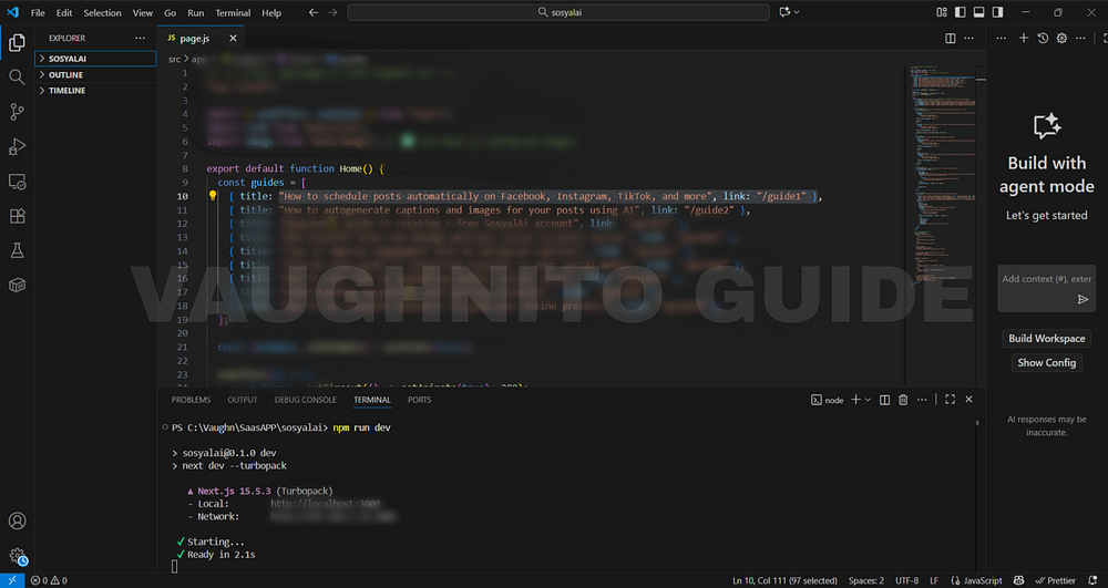 |
| Next.js code view of SosyalAi with easy-to-follow guides and helpful navigation links added for users. |
This was my “content brain.” All my article data titles, descriptions, and links stored neatly in one place.
Step 2: Mapping the Content Dynamically
Instead of repeating the same structure manually, I let JavaScript do the work using .map().
<div className="grid md:grid-cols-3 gap-6 mt-10">
  {guides.map((guide, index) => (
    <Link key={index} href={guide.link} className="block p-6 bg-white/10 rounded-2xl hover:bg-white/20 transition-all duration-300">
      <h3 className="text-lg font-semibold text-white mb-2">{guide.title}</h3>
      <p className="text-sm text-gray-300">{guide.description}</p>
    </Link>
  ))}
</div>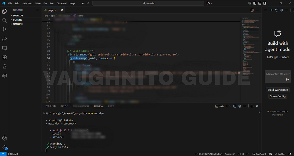 |
| Next.js interface showing how SosyalAi homepage integrates guide sections with styled navigation links. |
When I ran the code and refreshed the page boom! Nine perfect cards, all dynamically rendered.
Now I could add or remove guides in seconds by simply editing the array.
No more scrolling through a forest of <div> tags.
Step 3: Why Use .map() Instead of Hardcoding
This is one of those simple but powerful lessons in frontend development:
Don’t repeat yourself, automate yourself.
Here’s why I always prefer map():
- Scalability - Add new content with one line.
- Maintainability - Easy updates across multiple components.
- Consistency - Layout stays uniform and structured.
- Reusability - You can plug the same logic into other pages (like “Tutorials” or “Resources”).
- SEO Boost - Dynamic internal linking helps crawlers discover new content easily.
Step 4: Making the Grid Responsive
I wanted the cards to look good everywhere laptop, tablet, or phone.
That’s where Tailwind’s grid system came in handy:
<div className="grid grid-cols-1 sm:grid-cols-2 lg:grid-cols-3 gap-6">💡 Tip: Start from grid-cols-1 for mobile, then scale up.
It’s like responsive Lego same blocks, different shapes.
And because SosyalAi is a public-facing project, accessibility and adaptability matter. No one likes pinching and zooming just to read a guide.
Step 5: Adding Hover Animations and Personality
Static links are boring. So, I gave my cards a bit of “flirtation” subtle hover movements and transitions.
<Link
  href={guide.link}
  className="block p-6 rounded-2xl bg-white/10 hover:bg-white/20 hover:-translate-y-2 transition-all duration-300 ease-in-out shadow-md hover:shadow-xl"
>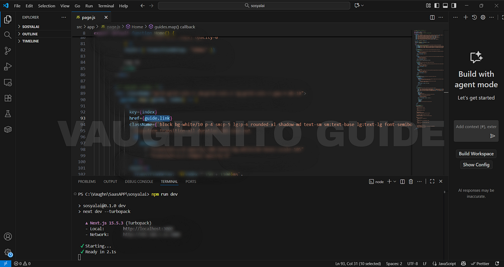 |
| Behind-the-scenes view of adding guides and helpful links to SosyalAi homepage for creators and app builders. |
Every hover now had a soft bounce, a glow like the guides were inviting you to click them. That’s micro-interaction design: small animations that make a huge difference in user retention. Because if a user hovers, they’re curious.
And curiosity is the best kind of clickbait. 😉
Step 6: The SEO Advantage of Internal Linking
Here’s something most developers overlook internal links aren’t just for navigation. They’re SEO gold.
By linking to my other SosyalAi articles, I was:
- Creating a network of related content (Google loves this).
- Increasing time on site readers move from one post to another.
- Improving topic authority (AEO loves well-linked content).
- Encouraging voice search discovery structured pages make it easier for AI assistants to recommend your content.
Example:
In my previous article, Building the Core Layout, I explained how to set up SosyalAi’s foundation using Next.js 15.
That single line does three things:
- Engages readers to explore previous content.
- Builds authority across my series.
- Strengthens the semantic relationship between posts for Google’s Knowledge Graph.
Step 7: Designing for Emotion and Engagement
I always say code isn’t just logic, it’s storytelling. Every hover, link, and color speaks a word.
So I asked myself:
How do I make readers feel that SosyalAi is more than just code, it’s a journey?
By using gradients that pulse softly behind my grid, transparent cards, and consistent typography, I created a visual rhythm. Each guide looked like a window into the next chapter.
Step 8: Final Touch - Testing the Experience
Before publishing, I tested:
- Responsiveness (Does it look great on mobile?)
- Hover fluidity (Smooth, not jittery?)
- Link accuracy (No dead paths)
- SEO crawl (Internal links structured logically)
Then I sat back, took a sip of coffee, and thought
Yep. My homepage doesn’t just look alive. It feels alive.
If you’re reading this as a developer ask yourself:
Are your pages just showing content, or are they telling a story?
Because that’s what dynamic rendering does it transforms a webpage into an experience.
Turning static guides into dynamic, linked cards felt like teaching my homepage how to talk. Every click became a conversation. Every hover felt like a wink.
That’s when I realized the true art of frontend design isn’t just in how it looks, but how it reacts.
If this resonates with you:
- 💬 Leave me a comment below, I read every single one.
- 🔗 Pass this to a friend who’s tired of expensive SaaS bills.
- ❤️ Follow me for the SosyalAi coding journey.
☕ If you’d like to support my work, you can buy me a coffee, I’ll keep turning caffeine into code!
👉 If you want to copy the entire homepage code, check it out on my official website.
🧭 What’s Next
In Page 7, I’ll guide you through how I connected SosyalAi to the world by adding social media links and icons directly to the landing page. Here, I integrated clickable icons using Next.js<Image>, made them responsive, and added hover glow effects for an interactive, professional touch. This stage marks the moment SosyalAi became more than just an app it became a socially connected platform, allowing visitors to instantly access my YouTube, TikTok, and other channels from the homepage of my FREE AI App for automating social media posting.Before you go, if this story inspired you to start your own build, you might also enjoy:
💌 Click the email icon at the bottom of this story to subscribe and get notified when I release new coding topics, tutorials, and behind-the-code stories.
Comments
Post a Comment