Page4 - Building the Core Layout Using Next.js - The Skeleton of my FREE AI App to Automate Social Media Posting
A great homepage isn’t just designed, it’s engineered with intent.
You ever stare at a blank page.js file and feel like it’s staring back? That was me when I began building SosyalAi’s homepage. Blank. White. Silent. But inside that emptiness was the potential of a living, breathing landing page, one that would greet users, pull them in, and whisper:
Relax, I got this automated.
That’s how SosyalAi Home started from nothing but vision, caffeine, and a few imports that changed everything.
Get the full code after reading.
Why Start with the Skeleton
Before the animations, gradients, and aesthetic glow there has to be structure. Think of it like a human body: muscles (CSS), organs (functions), and nerves (state logic) only work when attached to a solid skeleton.
When I began the layout for SosyalAi’s homepage, I didn’t jump straight into design. I started with the barebones structure the foundation that would hold everything together.
Here’s the mindset I followed:
- Clarity First: If the structure doesn’t make sense, the design never will.
- Minimal Imports, Maximum Purpose: Only import what you need and know why.
- Responsiveness from Day One: Don’t “add” responsiveness later. Build with it.
- Single Page, Single Focus: A landing page isn’t a maze. It’s a funnel, guide users, don’t confuse them.
That’s why I chose a single-page layout it loads faster, feels cleaner, and tells one story:
Automate your social media, the SosyalAi way.
Setting the Ground: use client
The very first line in my code says everything about my design intent:
"use client";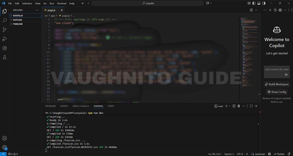 |
| Next.js code editor showing the base layout structure for SosyalAi home page setup. |
That line is small, but it’s the heartbeat of the entire app.
Here’s what it means and why it matters:
- It tells Next.js 15 that this component will run on the client side (not the server).
- This unlocks state management, animations, and real-time interactivity essential for buttons, transitions, and effects.
- It makes the app feel alive.
Without "use client", your page is like a statue - beautiful, but lifeless. With it, it becomes interactive - like a conversation between user and app.
The Four Imports That Built My Home
Every homepage has its pillars. For SosyalAi, they were these four:
import { useEffect, useState } from "react";
import Link from "next/link";
import Image from "next/image";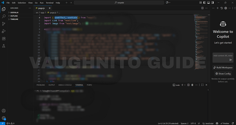 |
| Visual layout concept of SosyalAi home before adding animations and content sections. |
Each one carried its own superpower:
- useState → my tool for dynamic data. It keeps track of what’s happening inside the app like animation triggers, button states, or guide lists.
- useEffect → controls the flow of time inside the UI. For example, triggering smooth transitions when the page loads.
- Link → seamless navigation between app routes. No reloads, no jarring jumps — just clean transitions.
- Image → performance-optimized pictures. Because unoptimized images are like carrying 10GB in your backpack when you only need 500MB.
This combo turned a static idea into a living experience.
Structuring the Layout Hierarchy
Once the imports were ready, it was time to design the skeleton.
A homepage layout, in essence, is a hierarchy parent, children, and content sections. I built SosyalAi’s hierarchy like this:
<div className="relative min-h-screen flex items-center justify-center">
  {/* Background Section */}
  <div className="absolute inset-0 bg-gradient-to-br from-blue-500 via-indigo-600 to-purple-700" />

  {/* Content Section */}
  <div className="relative z-10 p-8 text-center">
    <h1>SosyalAi</h1>
    <p>AI-powered captions, automated posting, zero stress.</p>

    {/* Buttons */}
    <div className="flex justify-center gap-4">
      <Link href="/signup">Sign Up</Link>
      <Link href="/login">Log In</Link>
    </div>
  </div>
</div>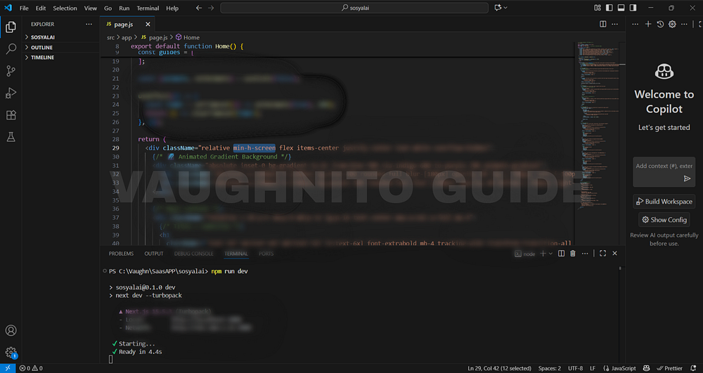 |
| Responsive grid structure built for SosyalAi home the base skeleton before styling. |
This layout looks simple, but it’s deliberately structured:
- Background Layer → creates the visual depth (gradients, animations, lighting).
- Main Content Layer → houses the core brand identity (name, tagline, call-to-action).
- Interactive Elements → guide user actions (signup/login).
This “layer-first” strategy keeps the design clean and predictable, making it easier to scale later when you add more features (like guide links or social icons).
Why a Single-Page Landing Works Best
I could’ve made multiple pages, but here’s the truth:
The longer users search for answers, the faster they leave.
So I built a single-page experience. Why?
- Speed: Instant loading equals lower bounce rate.
- Focus: Everything the user needs is right there.
- SEO Advantage: A well-optimized single-page layout can outperform multi-page designs in mobile searches.
- Voice Search Optimization: Google snippets and AI engines prefer clean, purpose-driven content.
And for an automation app like SosyalAi, clarity is the brand itself. The homepage shouldn’t explain everything it should invite curiosity.
Responsiveness: Designing for Every Screen
We live in an era where 70% of users scroll from phones. So I built SosyalAi Home with responsiveness at its core.
Using TailwindCSS, every font size, margin, and padding automatically adapts:
<h1 className="text-3xl sm:text-4xl md:text-5xl lg:text-6xl">
  SosyalAi
</h1>
<p className="text-base sm:text-lg md:text-xl lg:text-2xl">
  AI-powered captions, automated posting, zero stress.
</p>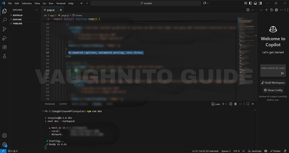 |
| Behind-the-scenes look at building the SosyalAi homepage layout the foundation of the free AI automation app. |
That’s not just design that’s empathy.
Because users deserve beauty whether they’re on a 6-inch phone or a 27-inch monitor.
I also made sure that each grid and button layout uses flexbox or grid systems:
<div className="grid grid-cols-1 sm:grid-cols-2 lg:grid-cols-3 gap-4">
  {/* Dynamic cards here */}
</div>
This ensures that no element overlaps, overflows, or hides even if the user resizes their browser like a maniac (we’ve all done it).
Clarity Over Complexity
Developers sometimes fall into the trap of showing off adding too many effects, shadows, and scroll events.
But SosyalAi was built on clarity.
Each section was created with a single intent: to communicate, not to confuse.
Ask yourself as a dev:
If I were a first-time visitor, would I understand this page in 5 seconds?
If not, strip it down. Clarity always beats complexity.
Here’s a minimalist structure I still swear by:
- Header Section: Brand name + tagline
- CTA Section: Signup/Login buttons
- Content Grid: Guides or featured topics
- Footer Section: Social icons + credits
Simple. Human. Beautiful.
I’ve built many pages before, but SosyalAi’s homepage taught me something deeper:
A homepage isn’t for showing what you can code, it’s for showing why it matters.
And that’s exactly what this structure achieved, A solid foundation that could support design, interactivity, and emotion in perfect balance.
Building a homepage skeleton is like setting the rhythm before playing music. You don’t start with solos, you start with structure.
So what about you?
What’s your current homepage structure like, too cluttered, or just right?Would your layout make sense even without CSS?
Until next time, keep your structure strong, your logic clean, and your homepage alive. 💜
🧭 What’s Next
In Page 5, I’ll dive into how I added style and soul to the SosyalAi homepage through animated gradient backgrounds. This is where static design met dynamic motion — using smooth color transitions, gradient animations, and subtle blur effects to bring energy and personality to the interface. It’s the stage where SosyalAi’s home started to feel alive, perfectly matching the creative spirit of my FREE AI App for automating social media posting.If this resonates with you:
- 💬 Leave me a comment below, I read every single one.
- 🔗 Pass this to a friend who’s tired of expensive SaaS bills.
- ❤️ Follow me for the SosyalAi coding journey.
☕ If you’d like to support my work, you can buy me a coffee, I’ll keep turning caffeine into code!
👉 If you want to copy the entire homepage code, check it out on my official website.
Before you go, if this story inspired you to start your own build, you might also enjoy:
💌 Click the email icon at the bottom of this story to subscribe and get notified when I release new coding topics, tutorials, and behind-the-code stories.
Comments
Post a Comment