Because a homepage without energy feels like coffee without caffeine.
You know that moment when your app finally runs but it still feels… flat? Like it’s working, but not breathing yet? That’s exactly how SosyalAi’s homepage looked before I added gradients that moved, shimmered, and pulsed like digital art in motion. In this post, I’ll share how I gave my project not just a background, but a soul using animated gradients, blur transitions, and keyframes that make your interface feel alive.
Let’s dive in. ⚡
Get the full code after reading.
The Moment I Realized My App Needed “Energy”
Every project reaches that stage where the structure is solid, the code is clean, but something feels off. That was SosyalAi after I built its core layout. Everything functioned but visually? It was like attending a rock concert with the volume turned off.
I wanted to create that feeling of motion, energy, and depth like how AI itself constantly evolves. So I thought, “Why not make the background flow like an algorithm?”
That’s where animated gradients entered the story. 🌈
Step 1: Building the Gradient Foundation
Let’s start simple. In Next.js 15 with Tailwind CSS, it’s almost effortless to build a gradient that breathes.
Here’s the first line of magic I wrote inside my main div class:
<div className="min-h-screen bg-gradient-to-br from-purple-600 via-pink-500 to-orange-400">
  <h1 className="text-white text-4xl font-bold text-center pt-32">
    SosyalAi — Simplicity Meets Automation
  </h1>
</div>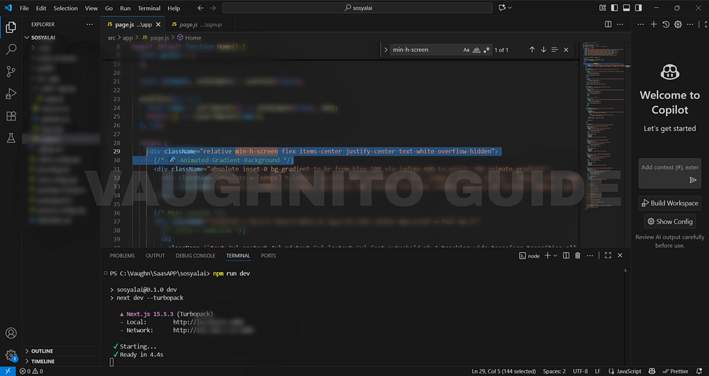 |
| Code editor showing Tailwind CSS gradient setup using bg-gradient-to-br for SosyalAi homepage. |
That bg-gradient-to-br means the color flows from the top-left to bottom-right.
I used from-purple-600, via-pink-500, and to-orange-400 to create a warm digital vibe something that says “AI meets creativity.”
💡 Pro Tip: Play with to-tr, to-bl, or to-l directions to control how your gradient breathes across the viewport.
Step 2: Bringing It to Life with Motion
Gradients are cool. Animated gradients are legendary.
When I first saw an animated gradient on a developer’s portfolio site, I thought:
That’s not a background that’s a heartbeat.
To make mine pulse and move, I created a custom animation using Tailwind’s configuration.
Open your page.js and add this snippet:
}
        .animate-gradient {
          background-size: 200% 200%;
          animation: gradientShift 15s ease infinite;
        }
        .animate-pulse-slow {
          animation: pulse 10s infinite alternate;
Then, use it like this:
}
        @keyframes pulse {
          0% {
            transform: scale(1) translate(0, 0);
          }
          100% {
            transform: scale(1.1) translate(20px, -20px);
}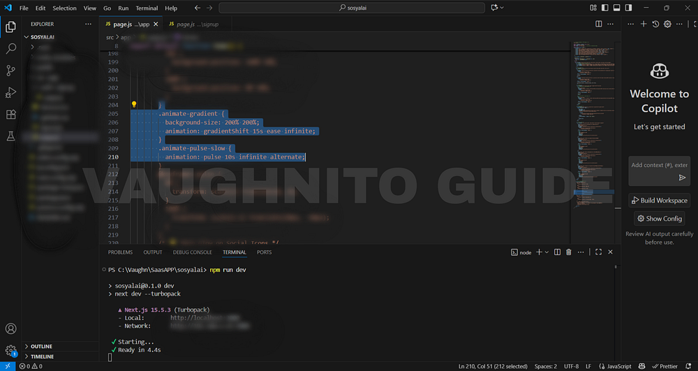 |
| Colorful animated background added to the SosyalAi homepage to bring more life to the design. |
Boom.
Now the background flows slowly shifting colors, like AI data waves visualized.
Step 3: Adding Depth with Blur and Glow
A flat gradient is good. But a blurred layered gradient? That’s the secret sauce.
I added blur effects to simulate energy waves behind my content:
<div className="absolute inset-0 bg-gradient-to-br from-blue-400 via-purple-500 to-pink-400 opacity-60 blur-3xl animate-pulse"></div>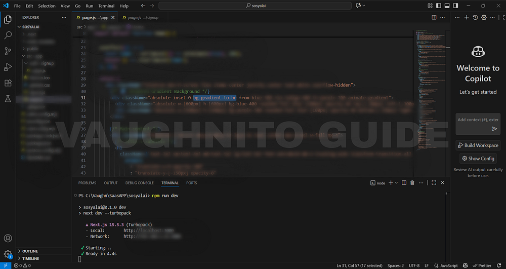 |
| Animated gradient background blending motion and energy into SosyalAi’s free AI app design. |
Then, stacked it behind my main section using relative and absolute positioning.
This created a soft-glow illusion like the UI was glowing from its own intelligence (hyperbole intended, but true).
Step 4: Crafting Motion That Feels Alive
Here’s the trick:
Too much animation feels like a carnival. Too little feels dead.
So I mixed pulse, blur, and slow gradient motion for rhythm — not chaos.
In page.js again:
animation: {
  'pulse-slow': 'pulse 4s ease-in-out infinite',
}
Then applied it:
<div className="bg-gradient-to-r from-fuchsia-500 via-purple-600 to-blue-500 animate-pulse-slow blur-2xl"></div>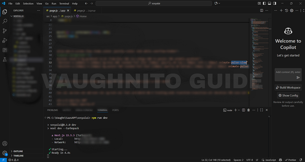 |
| Behind-the-scenes look at adding animated gradients to SosyalAi home for a vibrant modern design. |
When you view it in full screen, it looks like the background is breathing.
Subtle. Smooth. Intentional.
Step 5: Why Animated Gradients Work
There’s a reason why modern AI apps use color motion:
- It grabs attention instantly.
- It gives a sense of continuity users feel the interface is alive.
- It reflects AI’s dynamic nature always adapting, never static.
- It keeps users engaged longer (proven in UX metrics).
- It makes your project look like it belongs in 2025, not 2015.
If you’re building something that represents intelligence, creativity, or energy don’t ignore the visual rhythm.
Step 6: Keeping It Responsive & Clean
Gradients are heavy visuals, so I always test them on:
- Mobile first (if it looks too noisy, tone it down)
- Light/dark contrasts
- Performance on low-end devices
Tailwind makes this simple:
<div className="sm:bg-gradient-to-r md:bg-gradient-to-br lg:bg-gradient-to-l transition-all duration-700 ease-in-out">The gradient direction shifts as screen sizes change that’s responsiveness with personality.
Design Philosophy Behind SosyalAi
My goal for SosyalAi was to merge automation with emotion. I didn’t want a tech-heavy feel; I wanted something human like the app was talking to you.
The animated background became a visual metaphor: “Even in automation, there’s art.”
And that’s what every developer should remember code may be logic, but design is language.
Now, let me throw this question to you:
If your app could feel, what emotion would you want it to express? Calm? Confidence? Curiosity?
Because every color, gradient, and animation tells a story and that story is what users remember.
That day when I hit refresh and saw my SosyalAi homepage shimmer and breathe, I smiled like I just witnessed a sunrise through code. 🌅
That’s the joy of frontend design seeing lifeless pixels turn into personality.
🧭 What’s Next
In Page 6, I’ll show you how I made the SosyalAi homepage truly dynamic by adding interactive guides and internal links. This step transformed the static layout into a living, navigable experience mapping content dynamically withmap() instead of hardcoding, improving scalability and maintainability. It’s also where I enhanced SEO performance and user engagement by strategically linking pages and resources, turning the SosyalAi interface of my FREE AI App for automating social media posting into a smarter, more connected experience.If this resonates with you:
- 💬 Leave me a comment below, I read every single one.
- 🔗 Pass this to a friend who’s tired of expensive SaaS bills.
- ❤️ Follow me for the SosyalAi coding journey.
☕ If you’d like to support my work, you can buy me a coffee, I’ll keep turning caffeine into code!
👉 If you want to copy the entire homepage code, check it out on my official website.
Before you go, if this story inspired you to start your own build, you might also enjoy:
💌 Click the email icon at the bottom of this story to subscribe and get notified when I release new coding topics, tutorials, and behind-the-code stories.
Comments
Post a Comment